- work •
- statement •
- reviews + essays •
- resume •
- contact
deankessmann
Utilitarian Abstraction
archival pigment prints, various sizes, 2014—ongoing
edition 1/1
archival pigment prints
various sizes, 2014—ongoing
edition 1/1
Read a short description of this project






















Utilitarian Abstraction
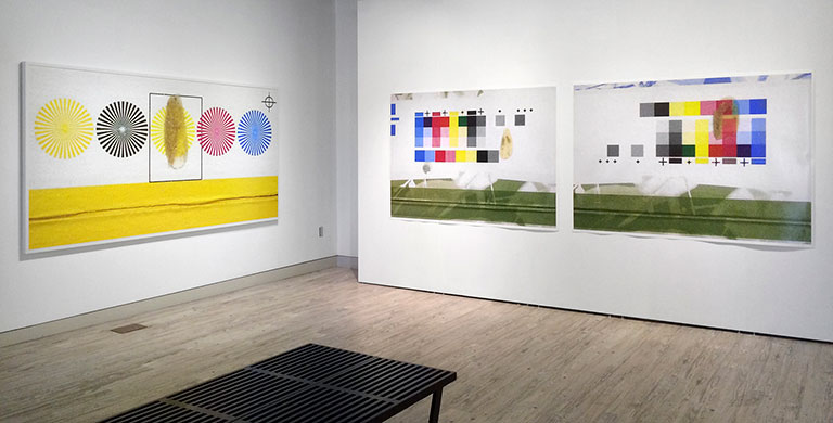
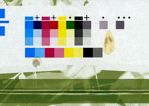
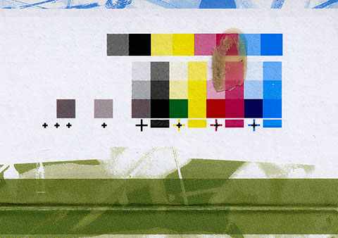
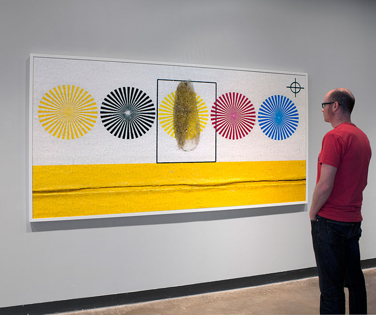
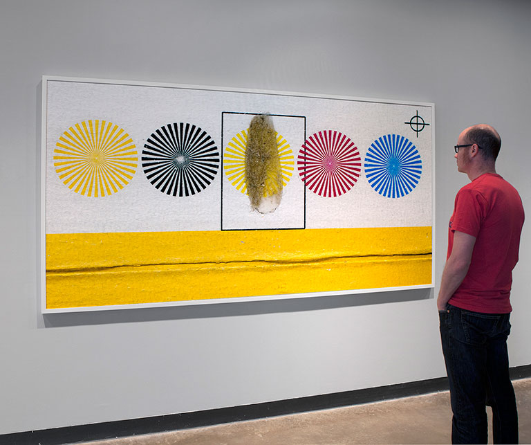
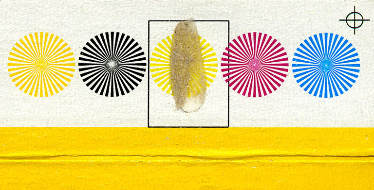
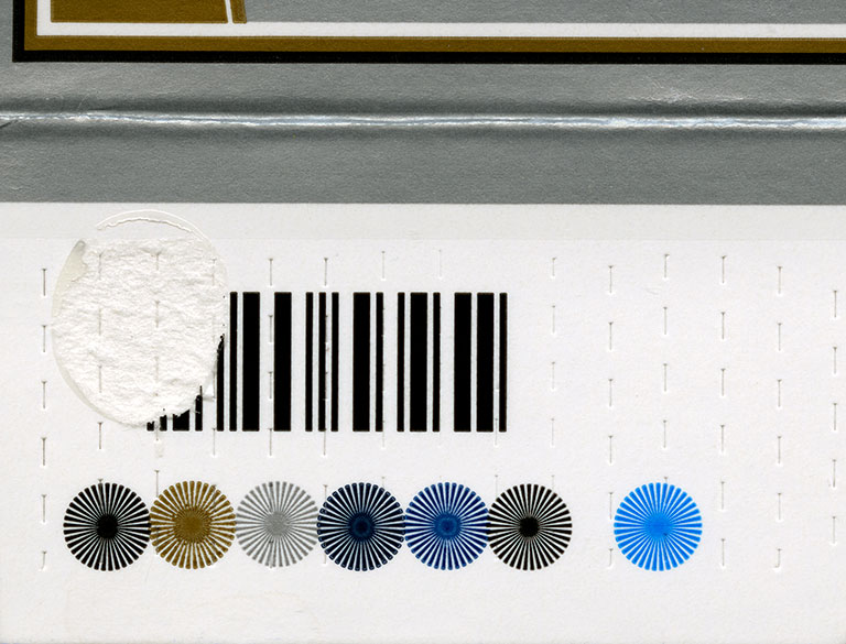
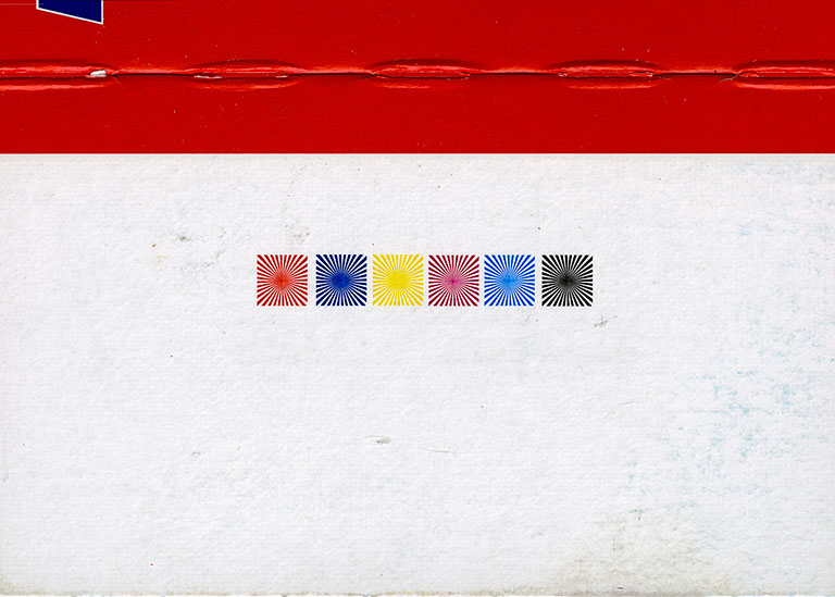
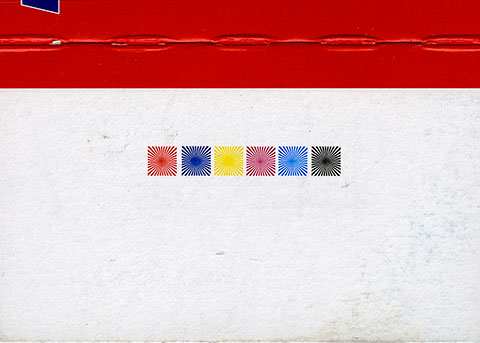
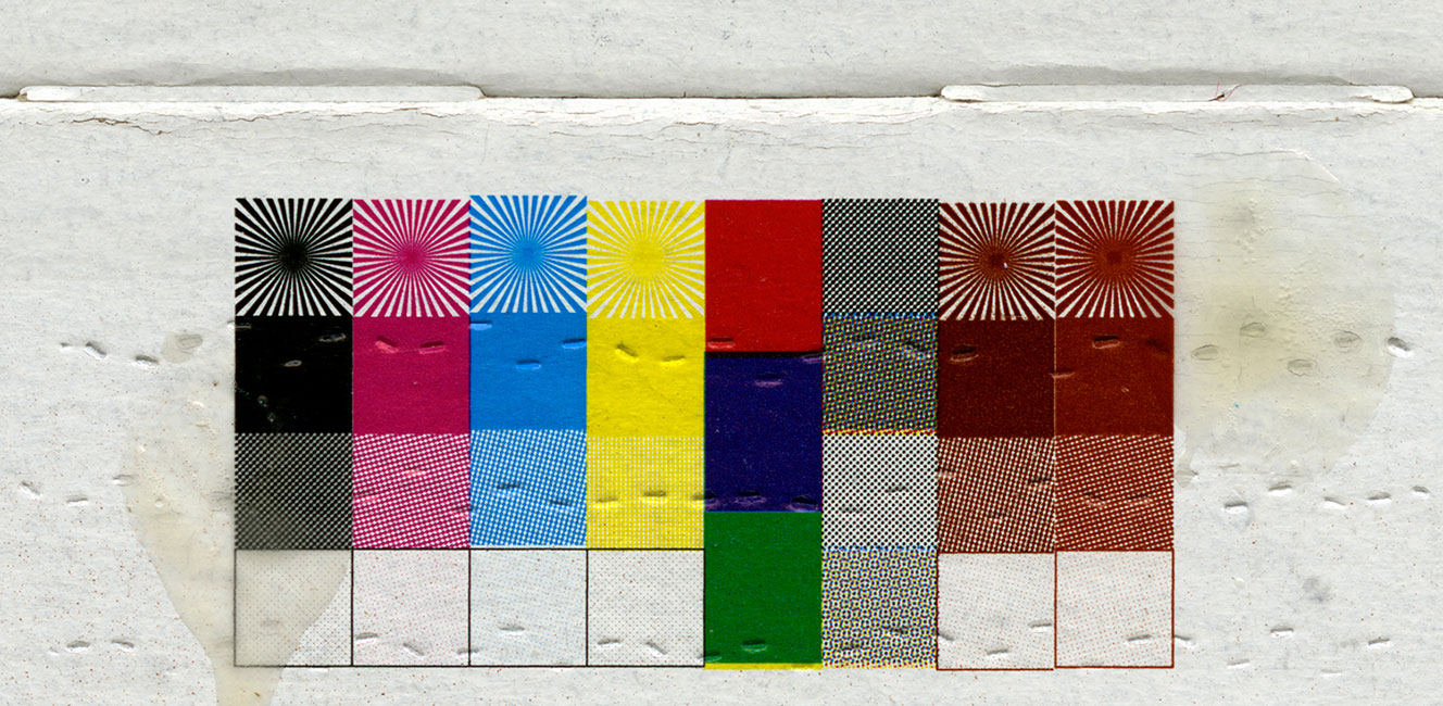
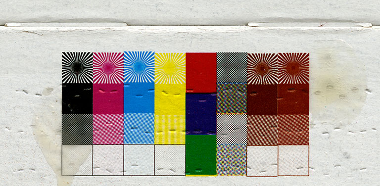
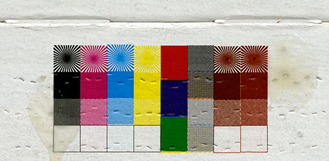
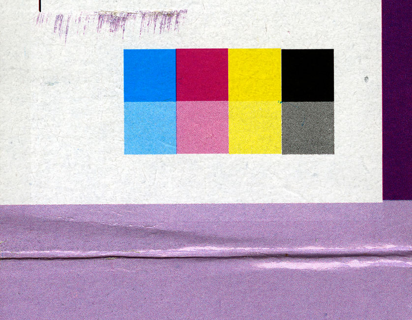
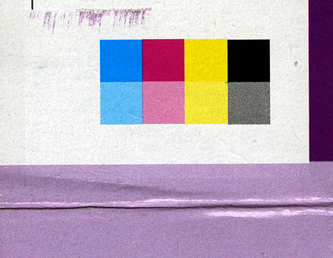
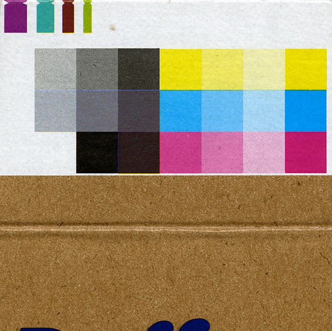
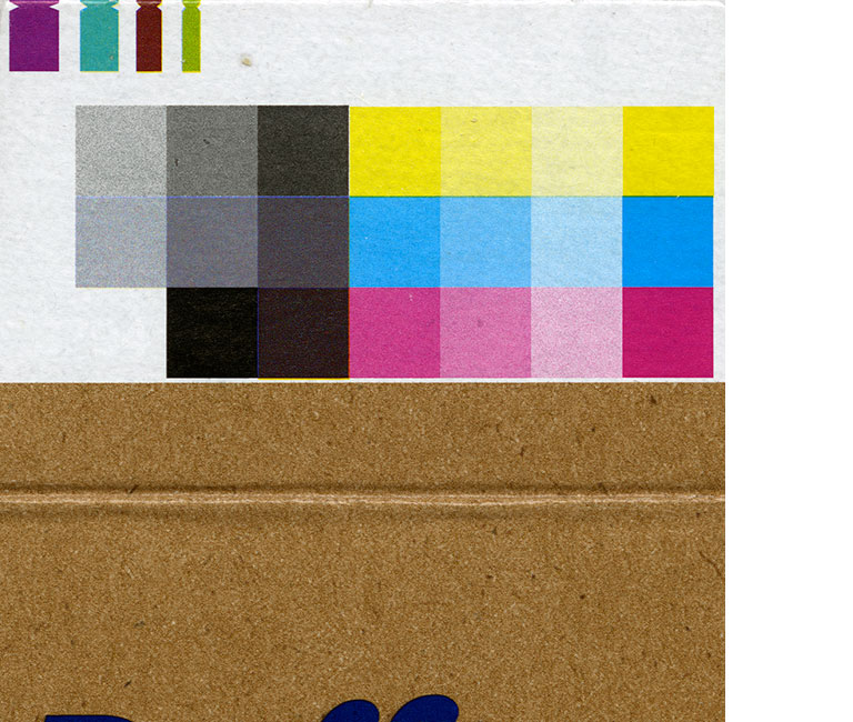
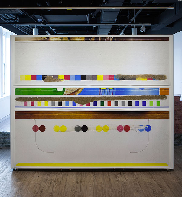
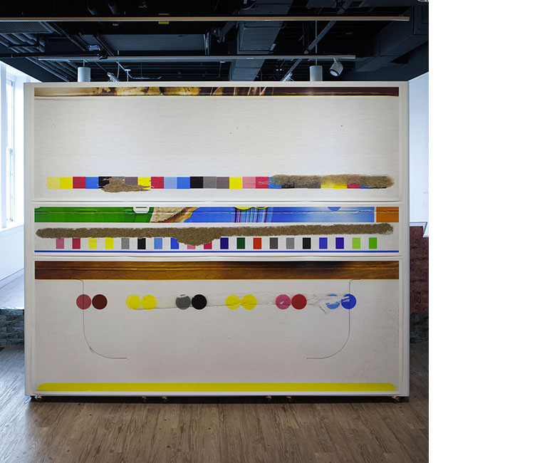
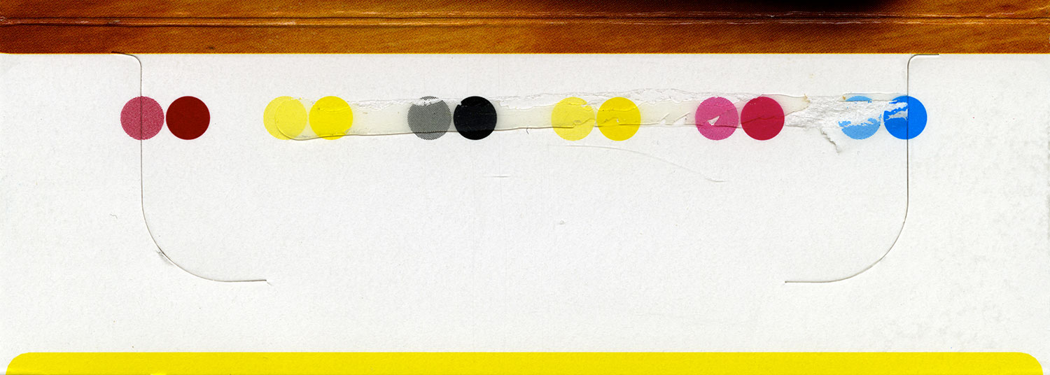
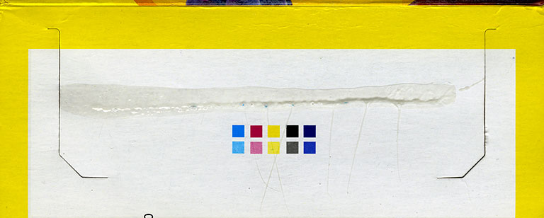
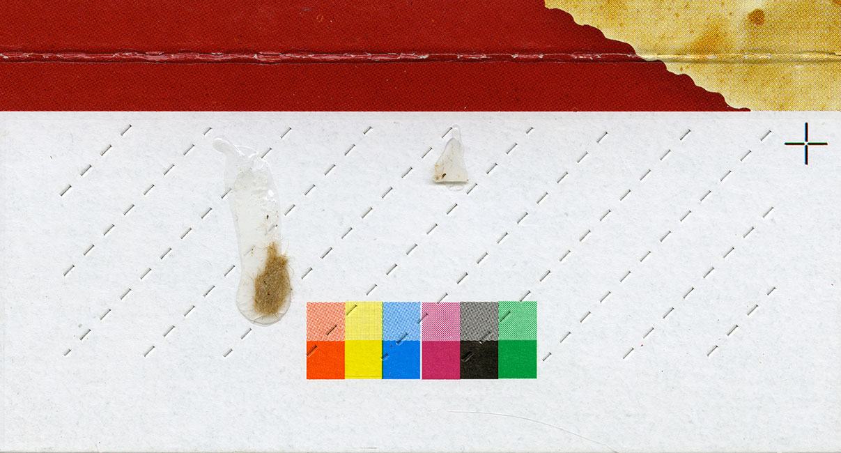
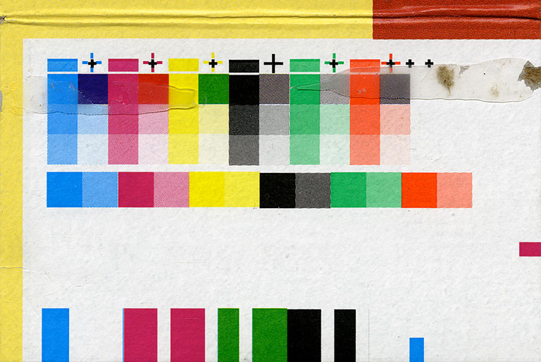
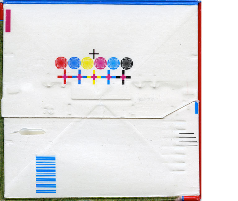
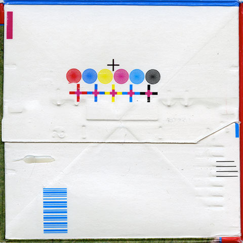
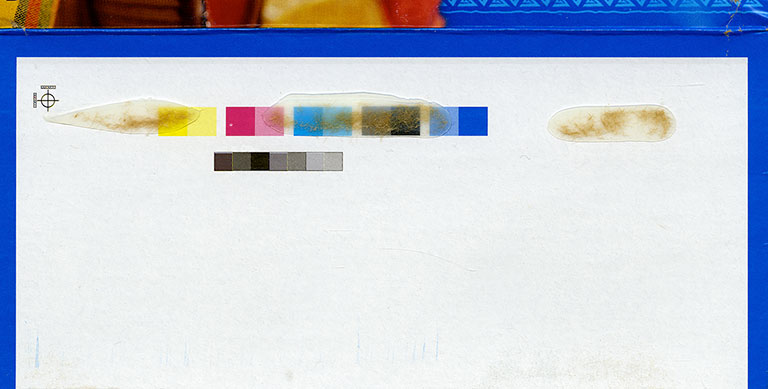
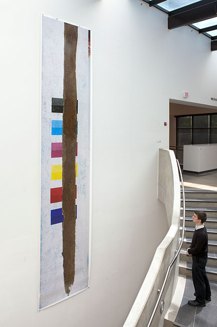
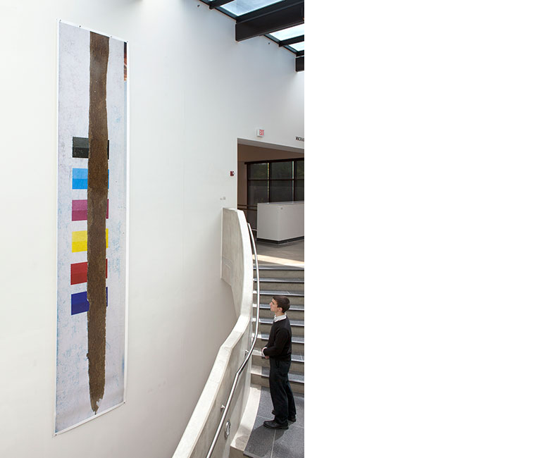
My interest in the swatches of colors and patterns in Utilitarian Abstraction developed through the banal process of breaking down cardboard boxes to be placed into the recycling bin. Therefore, this work, on some level, is autobiographical in that it paints a selective and subjective picture of my family’s consuming habits at a particular moment in the early part of the 21st Century. While the exteriors of the boxes are covered with photographs, graphics, and text meant to get our attention while shopping, graphic designers carefully place the printer codes that are the subject of this work in areas that are out of sight once they are assembled, generally on the box flaps. The original purpose of these utilitarian patches of colors and patterns is to enable printers to match the colors specified by their clients and keep the text and images in registration throughout the printing process. Additionally, since this imagery generally exists in those areas where adhesives are applied to assemble the flat pieces of cardboard into boxes, tearing them apart further alters their appearance. The glue stains, blemishes, and tears call attention to their imperfect material nature and the fact that they are common recyclables that all of us accumulate throughout our day-to-day lives. Thus, the final images are nowhere near the perfect digital files from which they are derived; instead, they are messy, a condition that is emphasized even more through the extreme magnification of this imagery. Finally, this work opens up the possibility for viewers to make newly discovered associations between high art and consumerism through the visual language of popular culture and contemporary notions of abstraction, and asks them to reflect upon the material messiness and tactile nature of ink-stained paper products in a digital age.